
During the family's trip to the waterpark capital of the world, my wife and I drive the few miles from our apartment to my parents' house a couple of times a day to let the puppies out, clean up any mess they've made, top off the food and water dishes, as well as do a little bit of laundry and raid the pantries. Plus, I get to play with the doggos. All in all, it's a mutually beneficial arrangement.
A couple of days into their trip, while I was conducting one of those aforementioned raids for snacks through the pantry, a big, blue box of cereal caught my eye:

At first, I was taken aback by the fact that Chips Ahoy! now has their own branded cereal - no wonder we Americans are fat. With the re-release of Oreo-O's, are we now in the middle of a no holds barred, cookie breakfast cereal bout? Will we soon be seeing "Keebler Elf Krunch" or "Mrs. Fields Flakes" stacked on store shelves? Yes, this is what really goes on in the wasteland that is my mind.
Once I got past that cookie conundrum, I noticed something else about the box of teeny tiny cookies - something you've probably already noticed by now. According to the big and bold yellow ribbon on the top of the packaging, these "parts of a balanced breakfast" come with trading cards!
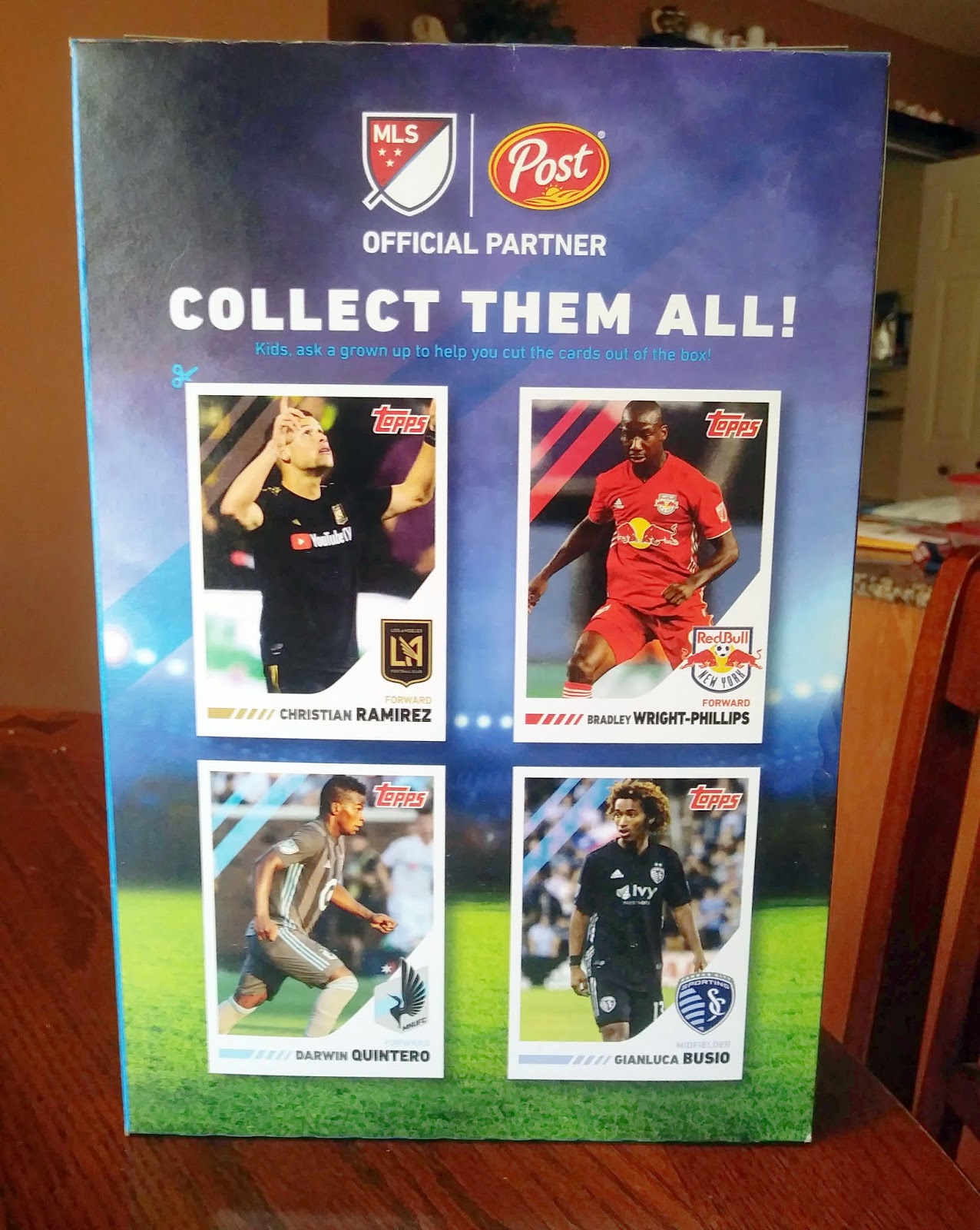
Now, I'm no soccer fan - I've been to exactly one game in my life and left in frustration as the contest would end in a scoreless tie - but, I will always go gaga over unexpected, oddball cards. So, even though my parents weren't around and thus there was no "grown up to help to help you cut the cards out of the box," I grabbed a pair of scissors and set about freeing these footballers from their cardboard holding cell:

I knew that this promotion was going on this summer; but, seeing as how I am not much of a soccer fan and I have been trying to stay away from sugary breakfast cereals, I had not paid too much attention to these oddballs. Plus, when Topps, Major League Soccer, and Post first joined forces last year to launch this promotion, I did my sampling of the product then - so, I guess you could say I got my fill. However, the temptation was far to great when I found them simply staring at my face in my parent's pantry.
Without any further ado, let's take a closer look at the unexpected treasures themselves:


This panel is slanted very heavily towards forwards - is that where all the star power is in soccer? I truly do not know. All I know, is that as a Windy City native, I sure would have appreciated the inclusion of a Chicago Fire player. Apparently, there are four different, four cards panels available on the backsides of Post products and not a single one of them features a single "Fireman." Where's the love for Bastian Schweinsteiger?
Also, today I learned that LA has not one, but two professional soccer franchises. I was not previously aware that the LA Football Club (for which Christian Ramirez stars) is an entirely different entity from the LA Galaxy. I guess if any market can sustain two MLS franchises, it would be one such as the City of Angels. Of the two clubs, I am much more familiar with the latter, thanks to David Beckham and this snippet from "I Love You, Man:"
You learn something new everyday, right?
My favorite card of the bunch is probably Bradley Wright-Phillips, mostly just because I am a big fan of Red Bull... the energy drinks, not the football club. Speaking of which, it throws me off how much corporate sponsorship has intertwined itself with their sport, with companies slapping their names on the front of team uniform kits and, heck, even straight up naming a team after a product. I don't know how I feel about that, but I guess MLS doesn't have the deep pockets that the NFL does and has to make money where they can.
I like simple design, with the white borders that are sorely missed from Topps Flagship products and the prominent use of team colors and logos. Honestly, this is a layout that I wouldn't have mind seeing used for baseball's Flagship. Although, the Topps logo in the upper right hand corner is unusually large... I guess they have to remind you who is being these cards since they are coming from a fair unusual source.
Oh, and I feel like I should show you how the backs of these cards look, as well:

Blank, cereal box cardboard. Very low maintenance, as I imagine it would be disruptive to the manufacturing promise and damaging to the bottom line to produce cereal boxes with printing on both sides.
In the end, these soccer cards are fun, appealing to the eye and I'm left wondering why the old bubblegum company can't make something like this happen with their baseball division. Granted, over the past few years, Topps has done a good job in expanding their horizons by partnering with other companies. For instance, PKWY Socks, Utz Potato Chips, and New Era, among others, have gotten with Topps to release promotional sets in the recent past. However, these products are always basically a reprint of the main Flagship cards with a different, branded stamp. I mean, I appreciate them diversifying their portfolio, but this just appears lazy.
Where's the creativity and wonderment? If Topps can get a little more imaginative with their soccer stuff, why can't they do something similar with their baseball products? They did a really good job of creating a fun, original tie-in product with their Marketside Pizza cards from a few years back; however, since then, it's been just stamps and logos. I tell ya, if Topps did this same promotion - heck, even with just this same design again - with panels of a baseball cards, instead of soccer, on the backs of Post Cereals, I would probably be eating Original Chips Ahoy! Breakfast Cereal for breakfast, lunch, and dinner!
In the meantime, my family just got home yesterday and have probably noticed that their pantry is much less filled than it was when they left. I should probably start "kicking" around a good idea for an excuse!
Coincidentally I was going to blog on the same cards this week. I rarely buy cereal now that my kids are grown and gone but I do still pick up a box of Special K or Raisin Bran Crunch from time to time. I noticed the soccer cards on a box of Honeycomb, a cereal I hadn't thought about in 40 years and was surprised to find was still on the shelves. I loved it as a kid. The result...I like the four cards I got...but Honeycomb is awful!!! Actually 'awful' would mean it tasted terrible. The truth is it didn't taste like anything. No flavor whatsoever. One serving was enough for me. the rest went in the trash.
ReplyDeleteIf there was a decent food-issued baseball set to chase in my area I would be all over that. I've seen the soccer cards at my local stores but they just aren't for me.
ReplyDeleteI like this year's design better than last year's. Kinda bummed... I went shopping for groceries yesterday and didn't even think to look for cereal box cards. Hopefully I find some next week... and if I do... I'm crossing my fingers in hopes of finding an Earthquake.
ReplyDelete