
"No bunts. Bunts is an out.... No bunting whatsoever. If someone bunts on us, throw it to first. Don't try to be a hero and go to second. Let them make the mistakes."
That bit of dialogue from one of the greatest baseball movies of all-time, Moneyball, let us know exactly what new-age, statistically-minded front offices think of archaic baseball, small ball strategies like bunting. Of course, nothing in life or baseball is truly black and white and a well-placed sacrifice bunt or attempt to bunt for a hit absolutely has it's place in baseball. That said, you are just handing the opposition an out, something that they should have to scrounge and battle for, seeing as you only get three per half inning.
When it comes to baseball cards though, there's no doubt that a Bunt is a good thing. Of course, I mean the now annual, low-end set release, with a digital connection, put out by Topps. Last year, we didn't see this product hit the shelves until late in the season; this year, the Kris-Bryant graced packs and blasters were being stocked in retail stores and LCS' across the nation in the second week of May. i don't know why Topps moved up the release by so many months, but I'm certainly not complaining - it was my favorite product of all of 2017.

Bunt started out as just a digital card application in 2015, downloadable on any smartphone, that allowed enterprising, young kids to swap exclusive digital "cards" with each other on their digital devices, while simultaneously streaming music from Spotify, texting their besties, playing Fruit Ninja, and posting selfies on Facebook. Then, last year, Topps thought it might be a good idea to their tie their digital product in with something physical, to get a bit of cross-promotion going, much in the same way they did with their Star Wars Digital Card Trader app.
While I could honestly care less about collecting digital scans and .jpg images of baseball cards, the physical version of Bunt really grabs my attention. The main reason for this is the cheap price point - it's right there with Opening Day as Topps' most inexpensive product, except this brand features it's own, unique base card design, instead of being a Flagship carbon copy.. Furthermore, the inserts included within the product are generally pretty fun. In short, when one wants to rip packs on a budget, like a cheapskate like me always does, Bunt is always the best option.
Thus, I was super excited when these packs finally appeared on the shelves on my local Target; my LCS doesn't stock the new-ish product. I couldn't help but pick myself up a jumbo pack as the wife and I finished up our Mother's Day and graduation shopping.
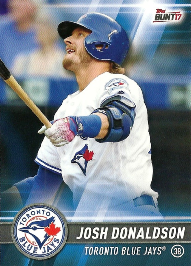


Here's a look at the base cards, of which I hadn't seen anything of the design before opening the above pack and of which none of the cards featured Cubs. The design is very slick and TV graphic-esque, which I'm sure looks quite sharp on the screen of an iPhone. Also, the central focus of the card is funneled almost exclusively to the depicted player, seeing as the background in the photograph has been completely obliterated. Again, keeping it slick for the screen.
What I really like about this set is the fact that the base cards are team color-coordinated in their "borders," as displayed by the three guys that you see above. That's a characteristic that will always win my collecting heart over - I love when my Cubs cards are blue and red.
Speaking of which...

This one is REALLLLLLLLYYYYYY blue.
Like I said, I didn't pull a single Cubs base card from my jumbo pack, but I was lucky enough to come away with this blue parallel of mister blue-eye-sparkle himself, Kris Bryant. Is it just me, or does it look as though someone left my card in the freezer overnight? Of these colored parallels (which fall one per normal pack), Black (1 per box), Green (#/99), Orange (#/50), Purple (#/25), Red (1/1) and the associated printing plates. These are gimmicky and kind of lazy parallels, but I'll still take an extra blue Cubs card.
Now, let's flip this card over and discuss the card backs, which are the same for these colored parallels as they are the base cards:

Very bare bones - so that they can be easily reproduced in the digital app, no doubt. We get the same basic personal information that we've been getting on baseball cards for years, plus a short bio. Additionally, Topps made sure to place the information on how to download it's digital counterpart application, just underneath the brief write-up, which makes sense when it comes to cross-promotion.
In short, nothing to see here - just your basic baseball card back with a small advertisement.
On that note, that wasn't the only Kris Bryant to fall out of my impulsively purchased, jumbo pack to Topps Bunt:


Again, seeing as the idea of this product is to generate some cross-interest in their digital card trader app, Topps has included the following "loot" cards, which include a special code that will allow you to earn some free "coins" for use in buying digital packs of cards. Basically, you can use the edge of a real coin to earn you some digital coinage. Seeing as I have no interest in reviving my Bunt account (I deleted the application several months ago because all it was doing was taking up space, though I tried it), I shan't be scratching this code any time soon.
Furthermore, even though this amounts as nothing more than an "ad" card and is what would otherwise be filler in any other pack of cards, the fact that it features Kris Bryant specifically and prominently as part of the advertisement makes it a true, blue Cubs card in my book. I'm just a cardboard junkie, just looking for any excuse to add a card into my binders.
Anyway, that does it for the Cubs content - let's take a look at the rest of my pickin's:


I got two more blue parallels, along with the reigning National League MVP. I may be a Cubs fan, but I live on the South Side and go to my fair share of Sox games every year - it still looks bizarre to see Adam Eaton in a Washington Nationals uniform.
As far as inserts go:

Andrew Miller, the seemingly invincible Cleveland reliever that the Cubs finally broke in the World Series last year, pops up in the Infinite checklist. It appears as though the basis of this set is just taking close-up shots of star players, robbing them of color and super-imposing them over the stadium in which they call home. Overall, I can't say that they look half bad, I just wish they hadn't turned Andrew into a photographic negative.
Speaking of close-ups:

"Alright Mr. DeMille, I'm ready for my close-up."
Perspectives is another insert set which focuses on players focusing on the field. Unlike the angular, Word Art-ish inserts from last year's editions of Flagship, the only true "perspective" in this insert checklist appears to be introspective, which I rate as a indifferent "meh." What's the purpose?
On the other hand, this next insert is anything but "meh":


My favorite insert, not only in Bunt but from any product, from last year makes a grand return - Programs. The concept of this set is fairly obvious, as the card is meant to look like an old, beat-up ballpark periodical, with dog-eared corners, torn up edges and even a table of contents on the back side all successfully playing part in the illusion. As an added, special touch, you can even see what appears to be a hint of a ticket stub poking out from under the "cover." I even learned something from this old "program" - I didn't know that the ol' knuckleballer managed the famous, all-women Colorado Silver Bullets baseball club.
Unfortunately for my Cubbie-centered collection, this is the wrong Niekro brother. This and any of the inserts and parallels that you see above, that aren't Kris Bryant, are available for trade. Just leave a comment below and I'll be sure to set them aside for you.
Before I go, I have one more note on these cards: I've noticed that these bad boys are uber glossy and super slick because of that fact. Trying to scan these cards kind of felt like trying to wrangle up kids that are all hopped up on birthday cake at a party - they were running away all over the scanner glass, like friction was a foreign concept. I wonder what the dealio is there.
At any rate, thus concludes my first experience with Bunt 2017 - it doesn't break any new ground, but it's still the most enjoyable low-end product on the market. I only wish that the base card set would be expanded beyond the 200-card set; let's make this puppy the second-coming of Topps Total, eh? I think that when the biggest problem with a product is that you want to see more of it, that's a pretty darn good problem to have on your hands.
See Brad Pitt? A Bunt isn't always a bad thing!
I mentioned the same exact thing about the gloss. Super slippery.
ReplyDeleteAlso...I just dropped a bunch of the Cubs BUNT base cards in the mail for you this morning, so you will have those in a few days.
I got caught off-guard with the release date as well, I assumed Bunt would be another late-season release until I saw someone post about it on Twitter last week. Went out and bought a box of them, and I think they're right on par with last year's look. The design is a bit too TV-graphicy for my taste, but the uber-colorfulness of the cards makes up for that.
ReplyDeleteReally like the Donaldson.
ReplyDeleteThat Eaton will still look just fine in my Eaton collection. (hint hint)
ReplyDelete