Meanwhile, some of the other problems I've been working on are much more expected. For instance, for the little ones, guiding them to their online learning games has been a challenge for teachers. Since they aren't yet that great at reading, a simple hyperlink or "favorite" will not do - they can't read it anyway. Thus, in my spare time, I've been working on creating a simple, picture-based icon system for them to use.
These little images should greatly assist them in their efforts to locate "ABC Mouse" and "Starfall" on their desktops.
Coincidentally, speaking of mini images that serve as icons, I acquired my first single from a similarly small and iconic trading card set from one of my LCS locations:
1951 Topps - the set that started it all - from an era long before every school in the country had a lab full of computers. While '52 might get all of the love, this oddball-sized set of cards built around a card game was the industry giant's first foray into an entirely baseball-based product. Therefore, this was the beginning of the collecting landscape that we have today.
Obviously, you can see that Mr. Hatton here hails from the red back portion of the checklist. Half of the set was produced with that color on the rear, while the other half came in blue. Apparently, the blues have come to be a little bit rarer, even though they were initially produced at the same rate.
Anyway, the New Lennox location of Baseball Card King had just recently relocated to a new site, just up the road; so, I figured I'd stop by to see the new set up while I was caught in a fit of boredom this weekend. They must have traded some stock with another store in the chain because in one of their glass display cases, I saw this beauty (with slight paper loss in the upper left corner) staring back at me. The cost? One measly buck.
Grady during his brief stint in the Windy City
Image courtesy of DJ's Autographs and Sportscards
I don't know about you, but that's a steal of a deal - in my opinion - for a 65 year old cardboard icon.
Even better is the fact that this super vintage single fits into my Cubs All-Time Roster Collection. Grady Hatton had a long career in the Majors, starting in 1946 (mostly with Cincinnati and Boston), which he wrapped up with a 28-game cameo for the 1960 Cubs. While Grady had already been represented in this CATRC binder, an authentic '51 Topps easily surpasses a reprint of his '52 card.
Authentic vintage always beats a reprint.
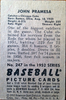
However, that wasn't the only card I picked up that lazy Saturday afternoon. In order to justify my 20 minute trip out to the shop, I kind of felt like I had to spend more than a dollar. Luckily, in the same case as that Grady, there was yet another piece of super vintage cardboard from an "iconic" set that fit snugly into my collection:
Hey, look - it's Topps rival from the time period. Hello Bowman (in my best Seinfeld impression).
Bowman had been in the game just a touch longer and their full-color, hand-painted imagery put them head and shoulders above the competition until Topps upped their game in '52. Even still, Bowman's offering that year, though not much different than previous releases, is still quite visually appealing.
Even if this one is slightly mis-cut. This "flaw" doesn't bother me too much; in fact, that's what keeps it in my price range.
Johnny Pramesa, like his former teammate Hatton, had already been represented in my CATRC; that said, his card depicted him with the Cincinnati Reds. As you can see, this one shows him wearing the proper Cubbie Blue. Furthermore, that previous inclusion was also a reprint from 1951; in other words, it never stood a chance.
Sorry C.C.C. facsimile!
All in all, I think I had myself a pretty nice Saturday afternoon, adding two super vintage "icons" to my collection for a price that was less than that of a bottle of Coke (another American icon) from the local filling station.
Here's hoping that the icons I'm designing for these kids are as helpful as these antiques were to my collection!


Neat cards! I'm a bit surprised to see that you were able to get these so cheap, especially since most card shops aren't known for having vintage items at reasonable prices.
ReplyDeleteCouple of iconic sets for sure there. I don't think I've ever heard of anyone getting a '51 Topps card for a buck, nice work!
ReplyDelete